
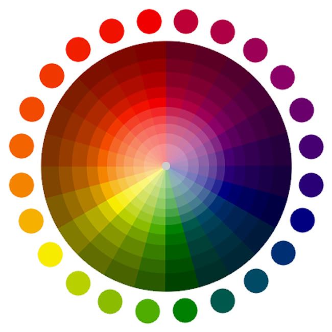
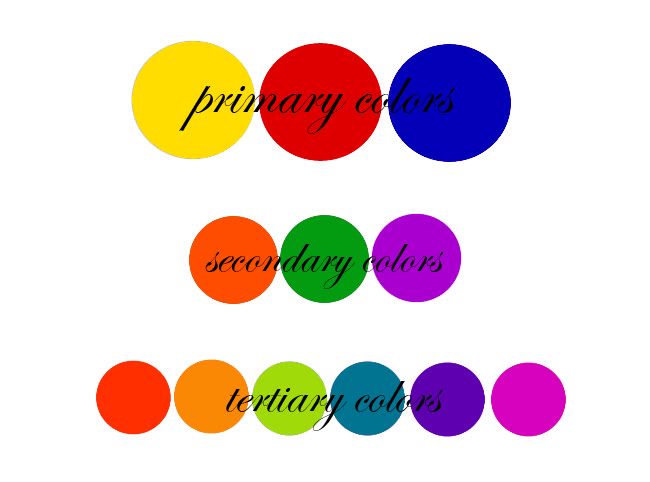
The colors on the color wheel relate to each other in different ways. Primary colors are what some call "true" colors: blue, yellow and red. Secondary colors are produced from the combination of two primary colors and include the rest of the rainbow we're familiar with: orange, green, and purple. Tertiary colors are produced from the combination of a primary and secondary color. We could continue infinitely, as the shade-and-tint wheel shows.
Colors directly opposite each other on the color wheel are called complimentary colors and together create a generally exciting and pleasing visual effect. While the pairing of a primary color and it's opposite results in a dramatic visual effect (imagine red + green), the pairing of secondary and tertiary colors with their compliments produces a more subtle, sophisticated effect, such as blood orange + teal.
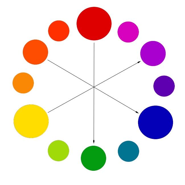
Arrows: primary shades and their compliments
Color blocking can be as easy as that: can't figure out how to style those bright blue shorts? Find an orange top. Keep in mind that the strength of the colors is important to color combining, as well. Wanna enliven your pale lavender blouse? Pairing it with a pastel yellow skirt would be a soft and pretty combination, while lemon yellow might overpower the pastel purple shade.
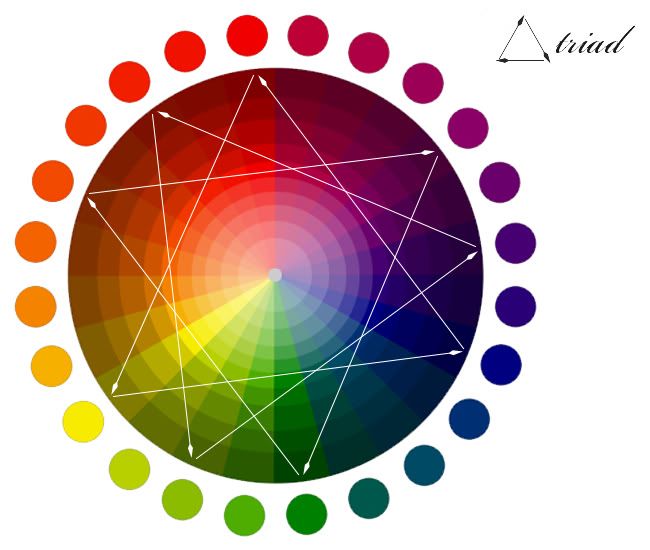
A triad is the combination of three colors equidistant from each other on the color wheel. I think of it as Color Blocking +, or conversely, the Golden Triangle. The most basic triad is red-yellow-blue. It can be overwhelming to wear three colors like this all together, so consider that two of the three colors may be used largely in the body of the outfit, with the third color appearing as an accent. For example, a purple and green floral print dress can really pop with a burnt umber belt or tights
.
Colors next to each other on the color wheel are also considered complimentary pairings. Pick a section of your favorite colors and go to town! Though I suppose the possibilities are endless, I think color blocking like Rainbow Brite tests the limits, so stick to no more than a handful of colors ;)
When pairing neutrals (greys, tans, browns, etc.) with bright colors, keep in mind that the neutral color may take on the hue of the brights' complimentary color. In color theory, neutral colors are affected by proximity to certain colorful, saturated hues. For example, grays worn next to bright reds can seem to have a greenish cast to them, since green is opposite red on the color wheel. A beige shirt may take appear orange-y if paired with certain purples.
Human beings can perceive over 2.8 million hues, so don't stress out too much about all of this theory. Some people will be energized by your orange and blue blouse and skirt ensemble, and others will be visually overwhelmed. Ultimately, you should wear what you like, even if it makes other people, or the color wheel, flinch ;)
♥ ♥ ♥
So what are your favorite color combinations?
Mine are purple & teal, pink-grey-white, turquoise & orange, and of course, black & white :)
[For more colorful reading, check out these posts: themanrepeller, academichic, fashionbomb]
No comments:
Post a Comment
Thank you for visiting my blog! I appreciate every comment and will try to reply to any questions.
I hope you're having a wonderful day or night :)